There are several wonderful plugins out there that handle shortcodes for Bootstrap-based themes, like Bootplate. However, we had a few ideas of our own, so we created another one called Bootplate Shortcodes.
If you’d like to use a different Bootstrap shortcodes plugin, we would suggest using either Bootstrap Shortcodes or Bootstrap Shortcodes for WordPress. We’ve tested them both here, so you know you’re good.
You can learn more about it and download Bootplate Shortcodes from the GitHub repo. The following offers some examples and documentation for the plugin.
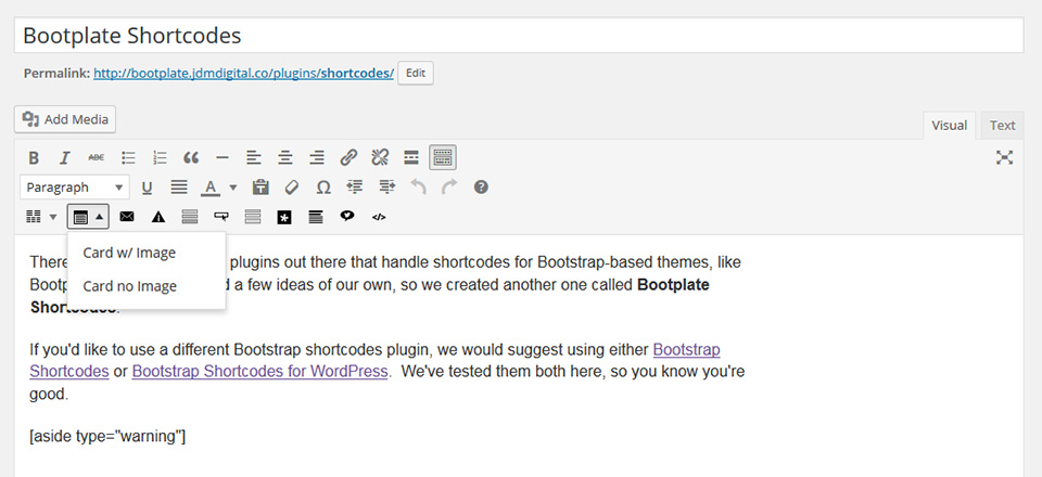
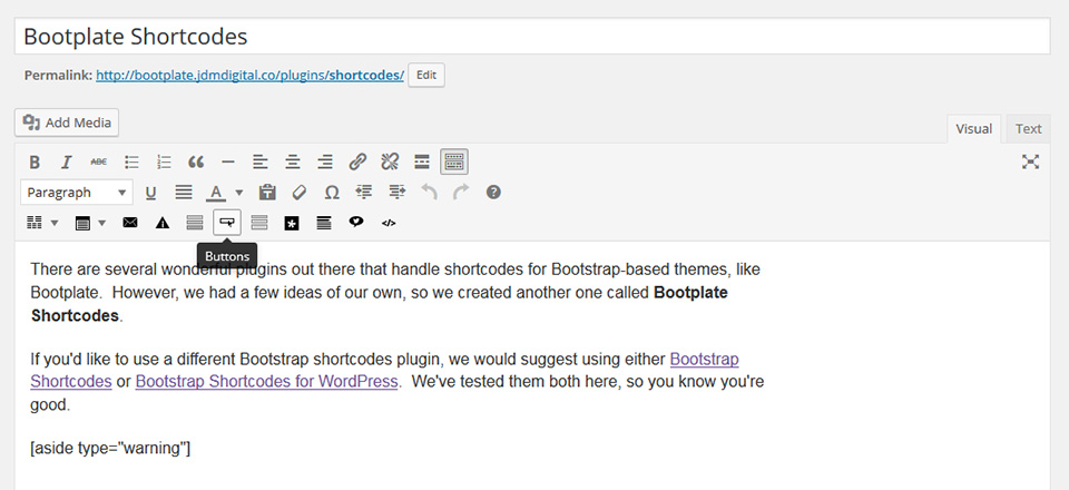
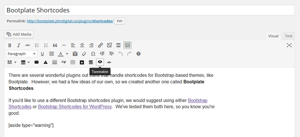
You don’t have to memorize all this jazz. Once the plugin is installed, you’ll find a series of new buttons in the page and post editor in a new, third row. Hover over the button for a ToolTip. Click it and it’ll paste-in the shortcode with some example content.
Let’s look at some examples, shall we.
Bootplate Shortcodes includes all your favorite HTML button classes from Bootstrap v3, and a few from Bootstrap v4 for good measure. All you have to do is click the Button shortcode in the Editor to insert an example shortcode for you to use.
The shortcode accepts two parameters:
type=""
– The button type. Leave this off and it defaults to a regular a href=""
with HTML5 role="button"
, but you can make it an actual <button type="button"></button>
if you set the type="button"
classes=""
– Here’s where the real styling happens. Simply add all the Bootstrap button classes you’d like added to this parameter to style the button to your liking.
Here are a sample of the classes you can use with examples. All Bootstrap buttons classes (including btn-lg, btn-sm, btn-block, etc.) are supported. It’s worth mentioning that .btn-default
is called .btn-secondary
in Bootstrap v4. No big deal. Bootplate supports both at once.
Bootstrap v4 includes a new button class, outlined buttons. We’ve included those classes in Bootplate.
To insert the button shortcode, simply click the button shortcode from the editor.
Bootstrap v3 and v4 both come with carousels, but there’s pretty terrible. They’re not very responsive, accessible, or easy to style and use. Bootplate doesn’t even waste overhead loading all the code to run these. Instead, we use Slick.js by Ken Wheeler.
{demo here}
To use, simply add any one of the following classes to a series of DIVs like so:
{insert Gist here}
We’ve included .slick-col-12
(full width, one column, no arrows), .slick-col-6
(two-column until you’re at tablet width and scrolls two at-a-time), .slick-col-4
(three column slick slider that shows fewer and fewer as the viewport narrows), and .slick-col-3
(just like the three column one except this one is four column).
We’re working on a shortcode for this now.
Tweetables are something that was super-popular not too long ago and are still used by a lot of very social marketing folks out there. We decided to include this functionality in Bootplate because of how light-weight it ended up being.
Use it or don’t, but it’s there if you’re into stuff like this.
In this paragraph, you see a bunch of boring content. However, when I write something that really grabs your attention, maybe I want to make sure you can easily tweet that sentance with a link to the page or post you’re currently viewing.
Something like Roses are #FF0000, Violets are #0000FF. Web nerds suck at poems–and so do you. That’s probably not even true. We’ll write something better later. For now, I think you get what a “tweetable” is.
Let’s talk now about how to use them.
Tweetables are used via a shortcode. The syntax is below. It accepts only one parameter and that’s the via=”” which is “twitter-ease” for your twitter handle so it’ll say “blah, blah via @whatever” in the actual tweet. The link it tweets is the link of the page you’re already on.
To insert a tweetable shortcode, just click the tweetables button in the Editor.
Bootplate drops Bootstrap v3 Glyphicons to lighten the load and, instead, loads just a handful of heavily-optimized font icons. To use these icons, you can use the icon shortcode.
See the Font Icons Reference page for a full list of class names and CSS details.
Since all these shortcodes can be nested, a good example would be something like:
Send Now!Which looks like this in the editor.
To insert a button or an icon shortcode example for you to work with, just click the button or icon shortcode from the editor.
A card is a flexible and extensible content container introduced in Bootstrap v4 Apha. It includes options for headers and footers, a wide variety of content, contextual background colors, and powerful display options.
If you’re familiar with Bootstrap v3, cards replace those old panels, wells, and thumbnails. Similar functionality to those components is available as modifier classes for cards. See the docs site for info on that stuff.
Below, you’ll find a whole series of Bootstrap v4 cards with images that are lazy-loaded as they enter your viewport.
This is the card body text. You can put pretty much anything here, but don’t go too crazy.
All ComponentsThis is the card body text. You can put pretty much anything here, but don’t go too crazy.
All ComponentsCards are managed from the WordPress admin using shortcodes. Here’s what one might look like.
The shortcode accepts a handful of parameters. Most of them are optional. Here’s a breakdown:
col="col-md-4"
insert whatever bootstrap column class you want there (without the period in front of the class name). This defaults to col-md-4 (one-third). You can also add more than one at different breakpoints. For example, col=”col-sm-6 col-md-4″. That would be one column at very small widths, two columns at small, and three at medium and up.
xclass=""
Optional, but this adds any additional (or extra class) you might like to the card itself. That makes it <div class=”card {xclass}”>.
imgsrc=""
Also optional, this is the full URL to the image you would like displayed in the card header (and lazy-loaded). Leave it off to skip it.
title=""
and subtitle=""
These are also optional and corrispond to the <h4> and the <h4><small> respectively.
link=""
and linktext=""
These are optional, but if you use one, you have to use both. The link=”” is the absolute URL to the web address you want the card link to go. The linktext is what you want the link anchor text to say.
Lastly, there’s openrow='n/y'
and closerow='n/y'
. To keep the number of nested shortcodes to a minimum, you can easily tell it to open a <div class=”row”> if you set openrow=’y’ and it’ll close that </div> row if you set closerow=”y”. Both default to “n” or “No”. By the way, you can use the words “Yes” and “No” if you want.
You don’t really have to remember all this stuff. Just click the Cards Shortcode button added to the Editor and it’ll insert example shortcodes for you to use with all the parameters set to their defaults for you to edit and update.
Want a color background to go all the way across the page? How about a way to break-up content using HTML5 <section></section> tags. Well, Bootplate has a shortcode for that.
Help! I’m in a full-width section with classes “bg-danger”.
You’ll find a (much better) example above where we’re using .bg-default to make the cards standout.
The section shortcode accepts just two parameters.
class="bg-default"
This sets the class of the <section>. It defaults to “bg-default” which should probably be some sort of a very light gray. Otherwise, you could use all sorts of Bootstrap colors, like: bg-danger (red), bg-info (light blue), bg-primary (primary color), etc.
reopen="y"
In order to work, this closes BOTH the <section> and the <div class=”container”> and leaves them closed. If you wanted to re-open those elements–because the section is not the last element on the page, simply set reopen=”y” or reopen=”Yes”. It defaults to No.
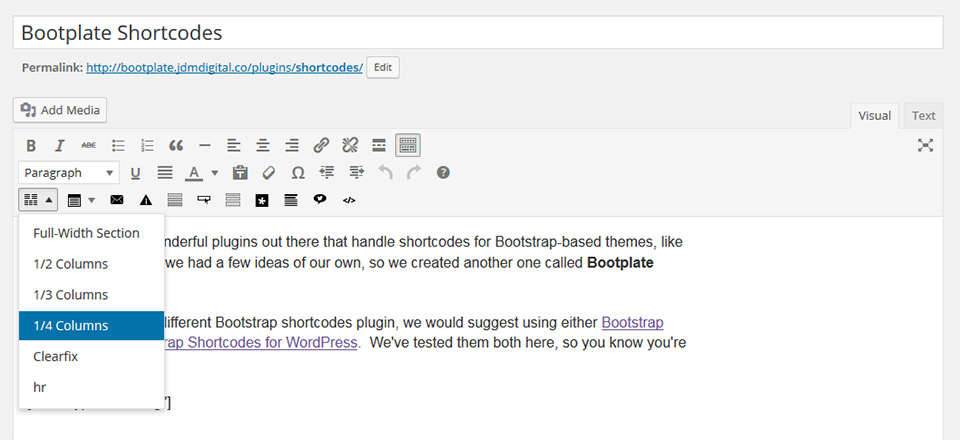
Gotta have column shortcodes, right? Maybe. If you’ve got some pretty crazy column layouts in mind, we’d actually recommend using a plugin like Bootstrap Shortcodes with Bootplate. But, if you just want a few simple columns managed using shortcodes, we’ve got your back.
Included in Bootplate Shortcodes are:
All of these shortcodes include just one parameter, xclass, which allows you to add extra Bootstrap classes to the columns.
Syntax/Example:
For two 1/2 columns, here’s an example syntax using the one_half shortcode:
Let’s say we wanted four columns on desktop, 2 columns on tablets and 1 column on mobile. Using Bootstrap grid classes, here’s what that might look like using the one_fourth shortcode.
Not that you have to remember any of these really. Simply hover over the column button the plugin adds to the WYSIWYG editor, click the dropdown, select the column type you’d like and it’ll insert example shortcodes for you to work with.
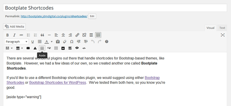
The aside shortcode is a little different. This is a Bootplate original and looks a lot like the .callouts used in the Bootstrap documentation. They’re a little different markup than Alerts, but they use the same alert-{color} classes.
I’m sure people will yell about us using the HTML5 <aside></aside>
in this way, but it DOES seem to fit the spec. Hate it? No problem. Just add html5="n"
to the shortcode to go back to the tried-and-true <div></div>
syntax.
To insert example shortcodes for aside, simply click the Aside shortcode button.
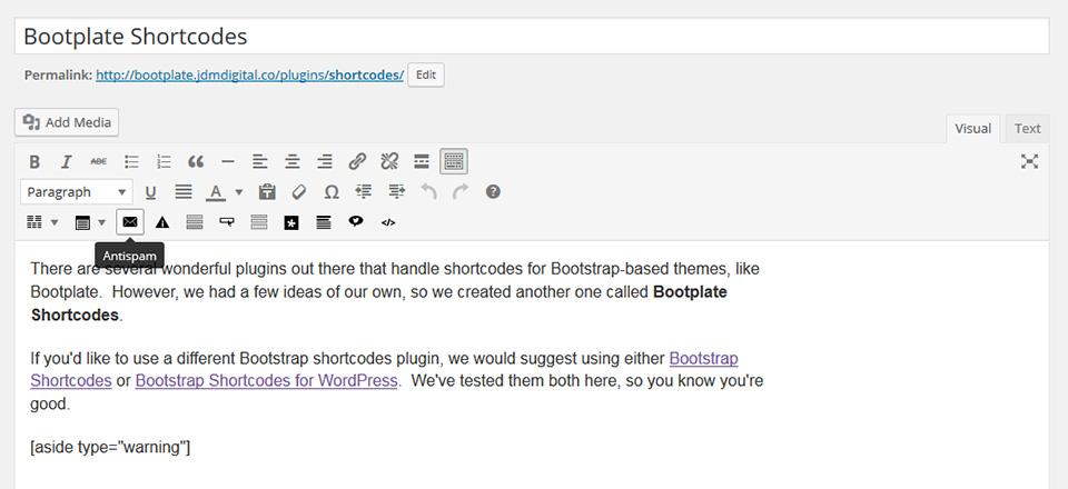
Surround any email address in antispam shortcodes to obfuscate the email address from spam bots searching the web for email addresses to add to their lists.
To humans, it’ll look and act the same as any other email address on a website. To a spam robot, it looks like complete nonsense.
NOTE: Please do not actually enter a “mailto:” link the email address between the antispam shortcodes. The shortcode will do that for you.